Problem Facing
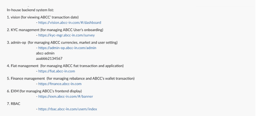
In addition to the three problems mentioned above, we have decided to launch a revamp project for both the user and operational sides. The multi-admin system has resulted in poor management and increased human costs. Additionally, the daily exchange limits necessitate more detailed information to be displayed on pages.
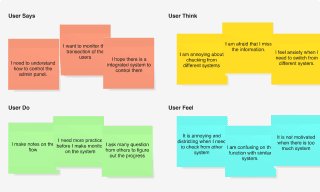
The inadequacies in user interface design have led to errors during transactions. Following the use of empathy maps, user journey maps, user flow chart to identify the core issues, we aim to resolve these issues through the implementation of a new admin system and UI design
Art board Naming and Component library
As the sole designer on the team leading the design direction for developers, my primary mode of communication with project owners and other stakeholders is through the Figma file. I adhere to a practice of meticulously naming art boards and creating a comprehensive component library.
This approach facilitates seamless communication, as stakeholders can easily reference specific codes or names to align discussions and ensure everyone is on the same page with my designs.
7
Developers benefits
in the conversation
34
Projects continue
on the system
Accessibility And Other Design Concern
Following discussions with the product team and client operations team, we have identified several focal points to enhance accessibility and user experience. We have developed a new UI design based on issues identified in the previous iteration. Additionally, we have referenced global standards such as WCAG and Google Page Speed Index to ensure our website aligns with high-quality service standards for all users.
Integration On Admin Sytem
As the sole designer on the team leading the design direction for developers, my primary mode of communication with project owners and other stakeholders is through the Figma file. I adhere to a practice of meticulously naming art boards and creating a comprehensive component library.
This approach facilitates seamless communication, as stakeholders can easily reference specific codes or names to align discussions and ensure everyone is on the same page with my designs.
Communication
Customers
Feedback Conclusion
Customers
Feedback Conclusion
Customers
Feedback Conclusion
Customers
Feedback
Conclusion
Data Storage
System Suggestion
Customers
Feedback Conclusion
Customers
Feedback Conclusion
Following discussions with the product team and client operations team, we have identified several focal points to enhance accessibility and user experience. We have developed a new UI design based on issues identified in the previous iteration. Additionally, we have referenced global standards such as WCAG and Google Page Speed Index to ensure our website aligns with high-quality service standards for all users.


